🔥 Новая модификация: Система скролл-эффектов!
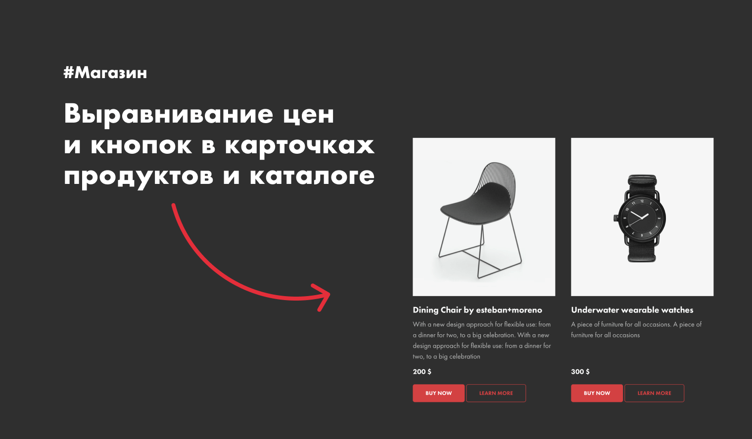
Выравнивание цен и кнопок в карточках продуктов и каталоге
Модификация выравнивает цены и кнопки в карточках продуктов относительно друг друга. Применяется для стандартных блоков ST305N, ST310N, ST315N, ST320N с подключенной или выключенной функцией «Каталог».
Как сделать
Скопируй этот код и вставь на свой сайт. Памятка по вставке кода.
<!-- https://romanyu.ru/vyravnivanie-cen-knopok-magazin -->
<style>
/* Блок ST305N без каталога */
.t776__parent {
    display: flex;
    flex-wrap: wrap;
}
.t776__col {
    display: flex !important;
    flex-direction: column;
}
.t776 .js-product-link,
.t776__content,
.t776__textwrapper {
    display: flex;
    flex-direction: column;
    height: 100% !important;
}
.t776__price-wrapper {
    margin-top: auto !important;
}
.t776__separator {
    width: 100%;
}
.t776__descr {
    padding-bottom: 12px;
}

/* Блок ST310N без каталога */
.t778__container {
    display: flex;
    flex-wrap: wrap;
}
.t778__col {
    display: flex !important;
    flex-direction: column;
}
.t778__content,
.t778__content > a,
.t778__textwrapper,
.t778__wrapper {
    display: flex;
    flex-direction: column;
    height: 100% !important;
}
.t778__btn-wrapper_absolute {
    position: static !important;
}
.t778__price-wrapper {
    margin-top: auto !important;
}
.t778__separator {
    width: 100%;
}
.t778__descr {
    padding-bottom: 12px;
}

/* Блок ST315N без каталога */
.t786__container {
    display: flex;
    flex-wrap: wrap;
}
.t786__col {
    display: flex !important;
    flex-direction: column;
}
.t786 .js-product-link,
.t786__content,
.t786__textwrapper {
    display: flex;
    flex-direction: column;
    height: 100% !important;
}
.t786__price-wrapper {
    margin-top: auto !important;
}
.t786__separator {
    width: 100%;
}
.t786__descr {
    padding-bottom: 12px;
}

/* Блоки ST305N, ST310N, ST315N, ST320N с каталогом */
.t951__grid-cont,
.t-store__grid-cont {
    display: flex;
    flex-wrap: wrap;
}
.t951__cont-wrapper {
    width: 100%;
    align-items: flex-start;
}
.t951__grid-cont {
    display: flex !important;
}
.t-store__card {
    display: flex !important;
    flex-direction: column;
}
.t-store__card > a,
.t-store__card__textwrapper,
.store__card__wrap_txt-and-opts,
.store__card__wrap_txt-and-opts > a,
.t-store__card__wrap_all,
.t-store__card__wrap_txt-and-btns {
    display: flex;
    flex-direction: column;
    height: 100% !important;
}
.t-store__card__price-wrapper {
    margin-top: auto !important;
}
.t-store__card__descr {
    padding-bottom: 12px;
}
.t-store__card__btns-wrapper {
    position: static !important;
}
.t-store__grid-separator {
    width: 100%;
}
.t-store__filter,
.t-store__filter__search-and-sort {
    width: 100%;
}
.t951 .t-store__filter {
    width: auto;
}
</style>
Понравилось решение?
Если возникли трудности с применением модификации, напиши мне в Telegram. Помогу разобраться
Какашка?!
Неужели все настолько плохо? Напиши свой комментарий, почему модификация не зашла, чтобы я мог подправить.